If touchscreens won, why am I buying buttons?
Touchscreens promised to replace buttons, yet I keep buying more of them. From Stream Decks and custom MIDI controllers to firewall shortcuts and voice control, this is the longer story of why the best interface is often the one that gets out of the way.

A shorter version of this essay was published by New Atlas as “If touchscreens won, why am I buying buttons?”
The older and lazier I get, the easier I want my life.
That was how the shorter version of this story began, and I see no reason to pretend there was a more dignified motivation. I didn’t buy a Stream Deck+ because I’d developed a scholarly interest in human-computer interaction. I bought it because saying, “Hey Yaffle, office aircon 24,” had started to feel like an unreasonable amount of effort.
The voice control worked. That was almost the problem.
I’d built an entirely local voice assistant, given it a custom wake word, connected it to Home Assistant and arranged things so that I could control the room without reaching for my phone. This was precisely the sort of futuristic domestic computing I’d wanted. I could speak to the house and the house would respond.
But sometimes I didn’t want a conversation with the house. Sometimes I wanted to press a button.
Click.
That’s the whole instruction. No wake word, no sentence, no brief pause while a machine decides whether I said “office” or “orifice,” and no audible response announcing that it’s successfully performed the thing I can already see it’s performed. Just a tiny physical movement followed by an immediate and predictable result.
It’s difficult to make laziness sound like a serious design principle, but reduced friction isn’t trivial. Friction determines which tools we use, which features we ignore and which apparently wonderful systems gradually become too irritating to bother with.
A function can work perfectly and still be a bad interface.
That distinction took me a while to understand.
The little box that became a control room
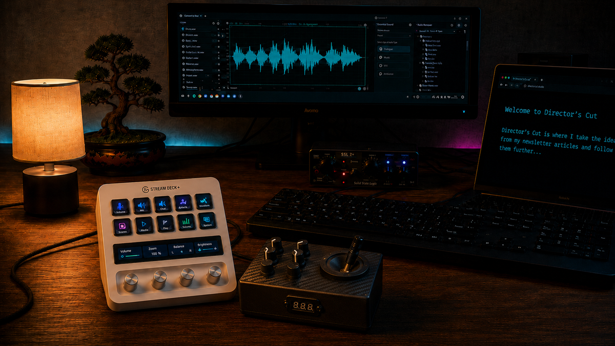
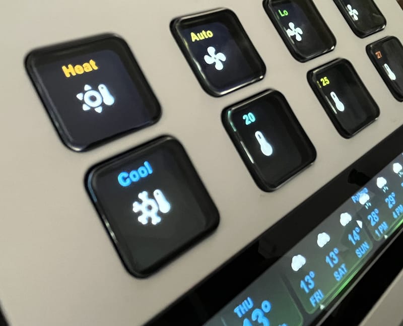
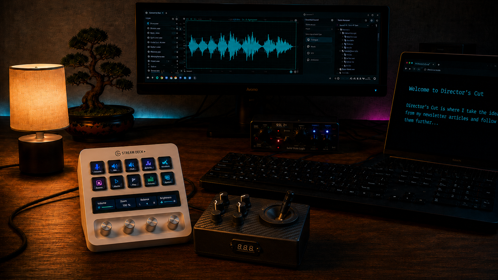
The Stream Deck+ is a desktop controller with eight programmable LCD buttons, four rotary encoders and a narrow touchscreen running beneath them. It looks like the sort of thing a video editor might use to switch cameras, trigger titles or control audio levels.
I didn’t have eight things I desperately needed it to do. That should’ve been a warning.
At first I assigned a few obvious functions. Open an application. Mute a microphone. Change an audio device. Turn a light on. Nothing dramatic, but the realisation and potential of a connection to Home Assistant turned my light on!
Then one button became a folder. The folder became a page. The page developed subpages. Before long, I’d built an entire dashboard.
Or two.
It began monitoring CPU and GPU activity. It could call up preset room environments through Home Assistant. It could control not just lights but entire scenes. The dials became contextual controls whose purpose changed according to which page was active.
The labels changed with them, which is the clever part. A conventional control panel has permanent labels and therefore permanent assumptions. A programmable controller can become whatever the present task requires. It has the adaptability of software but retains physical controls at the moment of action.
That combination matters more than it first appears.
The touchscreen didn’t actually lose. Neither did the button. What seems to be emerging is a truce between the two.
Software decides what a control means. Hardware lets the body operate it.
My favourite button, and surely the most needlessly specific, temporarily opens the firewall for my Internet of Things devices.
Most smart-home equipment would very much like to maintain an ongoing relationship with somebody else’s cloud. Cameras, thermometers, light bulbs and almost anything made by Tuya tend to assume they should be free to phone home. I prefer to keep them on a separate network and prevent them from reaching the internet.
This arrangement works well until something genuinely needs a firmware update.
The sensible way to deal with that would be to open the firewall interface, locate the relevant rule, enable it, apply the change, wait for the devices to update, return to the firewall, disable the rule and apply the change again.
Not difficult, just tedious. Tedious enough that I’ll put it off for six months.
So I made a button.
Pressing it grants the devices temporary internet access. After the allotted period, the rule closes again. They’re allowed briefly into the yard before being called back inside.
It’s an absurdly elaborate solution to the burden of clicking through a few menus, and I remain extremely pleased with it.
Yet the button also revealed something I hadn’t expected. Once routine functions were available on the desk, I stopped reaching for my phone nearly as often.
That shouldn’t have happened.
The phone won.
The sheet of glass
For roughly 20 years, consumer technology has been converging on a rectangular sheet of glass.
Phones lost their keyboards. Music players lost their transport controls. Appliances acquired touch-sensitive panels. Car dashboards became tablets with vehicles attached to them.
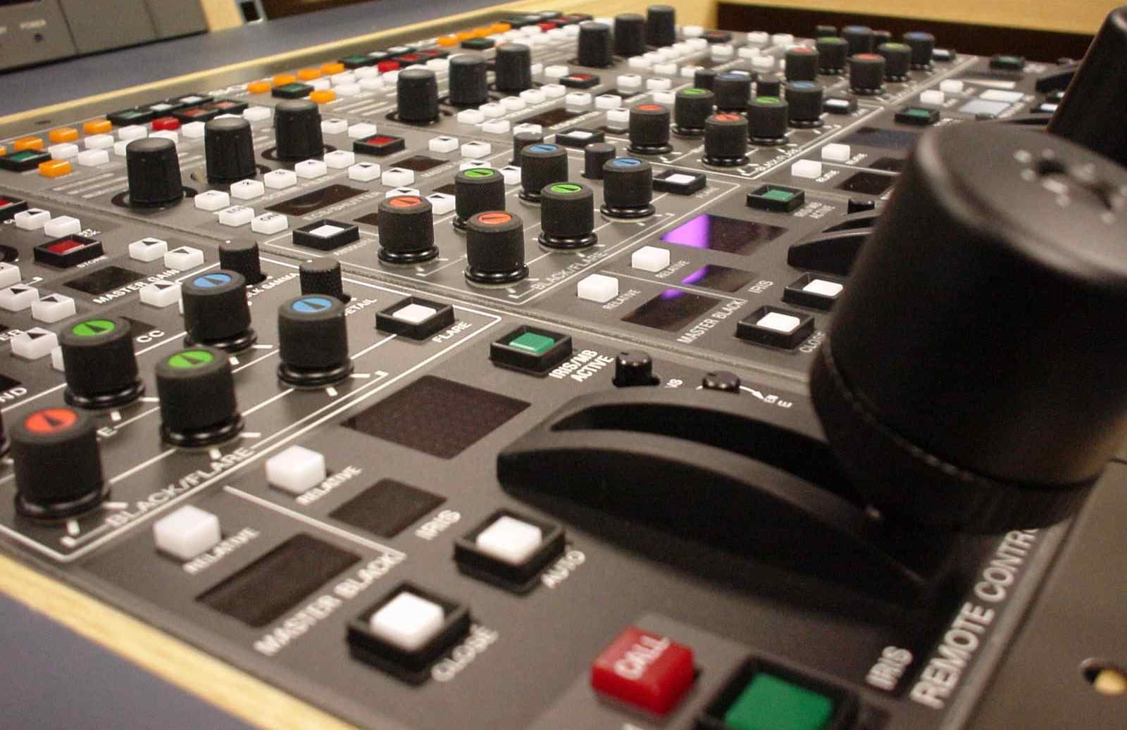
The advantages were obvious. A screen can display anything. Its controls can change according to context, language, user or software update. Manufacturers no longer need to design, manufacture and wire a dedicated button for every function. A clean surface photographs beautifully and makes almost any product appear more modern.
Physical controls began to look like mechanical baggage from a less sophisticated age.
There was just one awkward detail: people kept wanting them back.
The technology industry spent years developing increasingly elaborate ways to make touchscreens feel as though they had buttons. Haptic motors simulated clicks. Glass panels vibrated when pressed. Experimental displays made sections of their surfaces rise into temporary shapes. Software introduced shadows, highlights, animation and sound to suggest that flat images had physical depth.
Apple became exceptionally good at making glass acknowledge a touch. Other companies developed screens that could distort or push back. Automotive suppliers demonstrated dashboards that attempted to combine digital flexibility with tactile feedback.
There’s something wonderfully circular about it. We removed the physical mechanism, then devoted enormous ingenuity to reproducing the sensation that the mechanism had once provided for free.
That doesn’t mean touchscreens were a mistake. It means they solved one set of problems while quietly creating another.
A touchscreen is excellent for selecting from a large or changing set of possibilities. It’s less good when the user needs to perform one familiar action immediately, repeatedly or without looking.
The touchscreen’s greatest strength is that it can be anything.
Its greatest weakness is that, before touching it, you often have to look and determine what it currently is.
Attention is part of the price
Interface efficiency is usually measured in actions. How many clicks does something take? How many menus must be opened? How long does the operation require?
That misses an important cost: attention.
To change a setting on a touchscreen, I may need to look at the display, wake it, identify the relevant control, ensure the screen is showing the expected page, aim at a target and confirm that the touch was registered. None of those actions are particularly onerous, but they demand visual and cognitive attention.
A physical control can remain present even when it isn’t being examined.
Once I know that the second knob adjusts the volume, my hand can locate it while my eyes and thoughts remain elsewhere. The operation moves from conscious navigation into learned movement.
That’s why the question of physical controls in cars isn’t merely nostalgic. A driver shouldn’t have to conduct a small visual search every time the air conditioning needs adjustment. The danger isn’t that the screen fails. The danger is that using it successfully requires attention that ought to be directed through the windscreen.
A physical button has a location, shape, resistance and edge. A rotary control provides direction and distance. A lever communicates its state through position. Each gives the nervous system information before the action is complete.
Touchscreens are mostly interrogated with the eyes. Physical controls can be understood by the hand.
That difference also matters in less dramatic settings. During music production, editing or writing, looking away from the task can break concentration. The disruption may last only a moment, but the point of a well-designed interface isn’t merely to make an operation possible. It’s to let the operation occur without forcing itself into the foreground.
The best control may be the one you barely notice using.
Buttons aren’t inherently better
This is where the easy argument begins to fall apart.
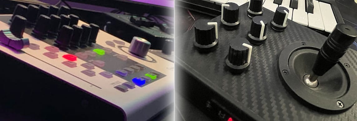
If physical controls were automatically superior, my Steinberg CC121 would’ve transformed my Cubase workflow.
I’d wanted one for years. It was an official hardware controller designed specifically for Steinberg’s music-production software, with transport buttons, rotary EQ controls, a
knob and a large motorised fader. On paper, it was exactly the sort of tactile interface I ought to love.
When I eventually bought one, I made a genuine effort to integrate it into the way I worked. I learned the controls. I placed it prominently. I tried to develop habits around it.
Then I returned to keyboard shortcuts because they were faster.
The controller was beautifully engineered. The fader moved under automation. The controls felt substantial. Nothing was technically wrong with it.
It simply didn’t fit me.
This was an important and slightly annoying discovery. I’d assumed I liked buttons. Yet here was an excellent collection of purpose-built buttons that I’d largely abandoned.
By contrast, a controller that someone had made specifically for me remains genuinely useful. It has a non-centring joystick and six assignable rotary controls. It can adjust volume, filter cutoff, resonance and other musical parameters. It’s particularly good for performing the expression and dynamics of sampled instruments, where drawing lines with a mouse feels less like music and more like filling in a tax return.
It’s also excellent for making a synthesiser wibble like the VCS3 in Pink Floyd’s “On the Run,” which may have been the real purpose all along.
The difference wasn’t physical versus digital. It was generic intention versus personal practice.
The official Cubase controller embodied somebody else’s idea of how Cubase should be operated. The custom controller expressed the movements I actually wanted to make.
A good interface doesn’t merely expose functions. It matches the user’s mental model of the work.
That’s much harder.
The myth of simplicity
A sheet of glass often looks simpler than a panel of controls. This is one reason manufacturers like it. Twenty buttons suggest complexity; one screen suggests elegance.
But hiding complexity isn’t the same as removing it.
The twenty functions still exist. They’ve merely moved into layers, menus, gestures, modes and contextual states.
A traditional amplifier might have separate controls for volume, input selection and tone. A modern device may place all three behind one multifunction knob and a display. The face of the product is cleaner, but the user must now remember what mode the knob is in.
This creates what human-computer interaction researchers call mode errors: the control performs a different action because the system is in a different state from the one the user assumed.
We’ve all experienced some variation of this. You begin typing and discover the cursor isn’t in the expected window. You rotate a multifunction dial and change the wrong parameter. You tap a control just as the interface refreshes and activate whatever has moved underneath your finger.
Physical controls can have modes too, of course. My Stream Deck certainly does. Its entire purpose is to alter what its buttons and dials do.
The important difference is whether the present mode is legible.
The small screens above the Stream Deck’s controls can show their current purpose. The controller may be infinitely reconfigurable, but the physical layout limits how much of that complexity confronts me at once. I can create a page for the room, another for audio, another for computer monitoring and another for some task I haven’t yet invented.
Each page is a temporary instrument.
That’s quite different from placing every available function into one enormous software interface and expecting the user to hunt through it.
The Stream Deck isn’t simple because it has few capabilities. It’s simple because it lets me decide which capabilities are currently visible.
Naturally, I tried to make it more complicated
Having discovered that the Stream Deck reduced friction, I immediately began creating friction by customising it.
This is the natural lifecycle of any device I own.
The Stream Deck+ has rotary controls with a display behind them. Elgato’s volume-control plugin can show applications, volume levels and other feedback on that strip. I wanted the knobs to look more like real hardware: photorealistic rotary controls rather than clean, generic software indicators.
It appeared straightforward. The profiles contained image data. The plugin had assets. There were PNG files. Surely I could replace the pictures and restart the software.
Before touching anything, we backed up the profile directory. This proved wise, because Stream Deck profiles aren’t stored as one friendly configuration file. They live beneath a thicket of generated identifiers inside:
C:\Users\ha1\AppData\Roaming\Elgato\StreamDeck\ProfilesV3
The backup became:
ProfilesV3-20260717-065919.zip
We located the relevant profile manifests and found embedded 256 × 256 PNG images inside the application settings. We extracted them, replaced them, put the new image data back and restarted Stream Deck.
Nothing changed.
The edited data remained in the files. The replacement images were valid. The profile had accepted the modification. Yet the physical device continued to display the original controls.
This is the sort of problem that creates a particularly corrosive form of doubt. When an edit disappears, at least the failure is clear. When the altered value persists but the output remains unchanged, every layer becomes suspect.
Was there another profile?
Had Stream Deck cached the original image?
Was the application overwriting the display after launch?
Had we modified an icon used only in the Stream Deck software, rather than the one sent to the hardware?
Was the supposedly active action actually being supplied by a different plugin?
The directory tree became a small archaeological site. The relevant plugin was installed beneath:
C:\Users\ha1\AppData\Roaming\Elgato\StreamDeck\Plugins\com.elgato.volume-controller.sdPlugin
Inside its bin directory was the compiled JavaScript responsible for its behaviour:
plugin.js
The breakthrough came when we stopped treating the problem as an image-replacement exercise and started tracing how the plugin actually drew the display.
Searching the plugin code for the obvious stored image references was less useful than looking for the commands that communicated with the Stream Deck hardware. Two names finally explained what was happening: setFeedback and getApplicationInstanceImage.
The plugin wasn’t simply taking our PNG from the profile and placing it on the dial strip. It was dynamically generating the visible feedback at runtime. The application image could be fetched or regenerated, then combined with a title, indicator and numerical value before being sent to the device.
The image in the profile was real. It just wasn’t authoritative.
That was the maddening part. We’d successfully changed the wrong thing.
This is a recurring technical lesson, although I seem determined to relearn it in new forms. A configuration file may contain a value without that value controlling the behaviour you’re observing. Modern software often consists of several overlapping layers: stored settings, defaults, caches, generated state, runtime feedback and hardware-specific rendering.
Finding a picture doesn’t mean finding the picture.
Once we understood that the stock plugin owned the display dynamically, the solution changed completely. We could either accept its visual language or create our own plugin.
So naturally we created our own plugin.
The project became streamdeck-custom-volume, living under:
D:\coding_projects\streamdeck-custom-volume
It required a small Windows helper, WindowsAudioSessionHelper.exe, because the controller needed reliable access to Windows audio sessions as well as control over what the device displayed. The plugin could then present the interface we wanted rather than attempting to persuade Elgato’s plugin to do something it hadn’t been designed to permit.
This was a ridiculous amount of work to make a digital knob look more like an analogue knob.
It was also the point at which the Stream Deck stopped being merely a consumer product and became part of my own computing environment.
The stock plugin offered volume control.
The custom plugin offered my volume control.
There’s a distinction.
Personal software is returning through hardware
Personal computers were once personal partly because their users were expected to alter them.
Early home computers arrived with programming languages, expansion ports and manuals that explained how the machine worked. Their limitations were obvious, but so was the invitation to participate.
Modern consumer devices are vastly more capable and often far less negotiable. They’re designed to provide a polished experience, not to become raw material for a different one.
The Stream Deck sits somewhere between those eras. It’s a finished commercial product whose real function is to be redefined by its owner.
Macro pads, programmable keyboards, MIDI controllers, small auxiliary displays and home-built control panels all occupy similar territory. They’re not replacements for general-purpose computers. They’re ways of carving specific controls out of general-purpose computing.
Software made our devices infinitely flexible, but that flexibility also left us operating our lives through interfaces designed for everybody.
Programmable hardware lets us make a tiny part of the computer specific again.
My firewall button would be commercially absurd. No manufacturer could ship a button labelled “temporarily allow Howard’s badly behaved IoT devices through OPNsense.” It’s useful only because it encodes my network, my rules and my preferences.
That’s precisely what makes it valuable.
This suggests a broader reason physical controllers are reappearing. They’re not merely nostalgic objects. They’re endpoints for personal software.
The hardware provides a stable gesture. The software lets that gesture become personally meaningful.
Voice isn’t the final interface
Voice assistants were once presented as the natural successor to screens. Instead of learning menus or controls, we’d simply state our intentions.
That remains an attractive idea. Voice is excellent when the hands are occupied, the user is moving through a room or the desired action would otherwise require finding a device. It can make technology more accessible and can collapse a complicated sequence into a simple request.
But speech has its own friction.
A spoken command has duration. It requires phrasing. It may need a wake word. It introduces uncertainty because the system must interpret language rather than receive a discrete mechanical input. It can be socially awkward, disruptive or inappropriate in a shared space.
Most importantly, speech isn’t always faster.
“Hey Yaffle, turn on the office evening scene” is wonderfully convenient when I’m entering the room carrying something.
It’s absurd when my finger is already resting beside the correct button.
Voice works best as one interface among several, not as the culmination of interface design.
The same is true of touch. The same is true of buttons. Each is suited to a different relationship between the user, the task and the surrounding environment.
The mistake was imagining that technologies succeed by eliminating their predecessors.
Photography didn’t eliminate painting. Streaming didn’t eliminate vinyl. Keyboards didn’t eliminate handwriting. Touchscreens didn’t eliminate physical controls.
New interfaces absorb some functions and expose the value of what remains.
Accessibility isn’t a side issue
The assumption that touchscreens are universally convenient also ignores the variety of bodies expected to use them.
A perfectly flat interface provides little information to someone with impaired vision. Small targets can be difficult for users with tremors, limited dexterity or reduced sensation. Capacitive screens may fail to recognise dry skin, gloves or unconventional forms of touch.
One reader responding to the original article described repeatedly tapping and sliding different fingers across screens that simply refused to acknowledge the contact. That isn’t a minor inconvenience when essential controls have been moved onto the glass.
Physical controls can create accessibility problems too. Buttons may be too small, require excessive force or be arranged without clear distinction. No interface is automatically inclusive.
The issue is choice.
A system that can be operated only through a touchscreen assumes a specific set of physical abilities. A system that offers tactile controls, voice, software access and automation gives users several ways to reach the same result.
Redundancy is sometimes treated as inelegance. In accessibility, redundancy can be freedom.
The best interface may be the one that disappears for me, but another user may need it to become more visible, more audible or more tactile.
Programmable controls are particularly interesting here because they allow the number, size and purpose of controls to be adjusted. Instead of forcing every user through the same comprehensive interface, the system can expose only what matters to a particular person.
Simplification by selection.
Continuous controls for continuous things
One of the comments beneath the original article raised another useful distinction: continuity.
Touch interfaces frequently convert continuous adjustment into repeated taps, swipes or visual sliders. A real rotary control can provide an immediate sense of direction, speed and magnitude. A fader communicates a range through physical distance. A joystick allows several parameters to be manipulated as one gesture.
This is especially important in music.
Volume, expression, pitch, filter cutoff and resonance aren’t naturally binary values. They unfold over time. The physical movement becomes part of the performance.
A mouse can enter the same data. Automation curves can be drawn more precisely than they can be played. But precision isn’t the only property that matters. A performed movement contains timing, hesitation, momentum and correction.
Physical controls can turn parameter entry back into an action rather than an instruction.
That’s why my custom MIDI controller worked where the official Cubase controller didn’t. Its joystick and knobs weren’t merely shortcuts to software functions. They were instruments through which continuous changes could be felt and shaped.
The distinction extends beyond music. Steering, braking, acceleration, camera focus, machine operation and many forms of scientific or industrial control benefit from interfaces that communicate magnitude through movement.
Digital systems can represent values with enormous precision. The human body doesn’t necessarily want to enter those values one digit at a time.
Sometimes the continuity of the gesture matters more than the resolution of the number.
A control is also a commitment
There’s another reason dedicated controls feel different from software menus.
Giving a function a physical button declares that it matters.
Most applications contain hundreds of commands. Many remain buried because every function can’t be permanently visible. Assigning one to a key, dial or button promotes it from possibility to habit.
My Stream Deck doesn’t merely make certain operations quicker. Its layout reflects what I consider worth making quick.
This can alter behaviour. A backup button is more likely to be pressed. A room scene becomes part of the daily routine. A monitoring page makes resource use more visible. A temporary firewall action becomes safer because its closure can be automated rather than left to memory.
Interface design therefore isn’t neutral. The controls we expose influence the actions we perform.
Phones demonstrate this constantly. Applications compete for the home screen because visibility creates use. Notifications demand attention because interruption creates engagement. Features placed behind additional taps are used less frequently, regardless of their objective value.
A personal controller lets the user reverse that relationship. I decide which functions deserve immediate access.
It’s a small act of sovereignty over the machine.
The desk as a cockpit
There’s an obvious danger here.
Once physical controls become programmable, there’s no natural stopping point.
A button saves time, so I add another. Pages prevent clutter, so I create more pages. A dial can adjust one parameter, so I make its function contextual. Status displays are useful, so I add CPU, GPU, network and environmental information.
Eventually the allegedly frictionless interface requires documentation.
The desk begins to resemble a cockpit, and not necessarily one designed by an aviation authority.
This is where personal interfaces can fail in the opposite direction. Because every addition seems locally useful, the total system becomes globally incomprehensible. The user who built it may remember the logic for a while, but even personal software can become somebody else’s software after six months.
The solution isn’t necessarily fewer controls. It’s stronger structure.
A good control surface needs consistency. Similar operations should occupy similar positions. Dangerous actions should be difficult to trigger accidentally. Current modes should be obvious. Labels should describe outcomes rather than implementation details. Controls used frequently should remain stable enough for muscle memory to form.
A programmable interface shouldn’t change merely because it can.
The physical position of a control is part of its meaning. Reassigning everything constantly destroys the very tactile certainty the hardware was supposed to provide.
The trick is to combine flexibility with permanence: enough software-defined behaviour to adapt the device, but enough spatial consistency that the body can learn it.
That’s more difficult than throwing icons onto buttons.
I’m still learning it.
The real enemy is interruption
The original question was whether touchscreens had won.
I no longer think that’s the useful question.
Touchscreens won the contest to become the general-purpose interface carried in almost every pocket. They’re extraordinary. A single surface can become a camera, map, keyboard, musical instrument, television, library, payment terminal and communications system.
Physical controls didn’t lose. They retreated towards the tasks for which general-purpose interfaces are least suitable.
They remain where speed, precision, continuity, certainty and muscle memory matter. They return when users become tired of looking through menus. They reappear when the cost of visual attention becomes obvious. They thrive wherever a repeated action deserves a stable gesture.
The Stream Deck is successful not because people have rejected software, but because software has become pervasive enough that we need better ways to reach through it.
I thought I was buying buttons. What I was really buying was a way to decide which parts of the digital world deserved immediate physical form.
Sometimes that form is a key.
Sometimes it’s a dial.
Sometimes it’s a joystick that exists largely to make a synthesiser wibble.
Sometimes it’s a button that opens the firewall long enough for a collection of imprisoned thermometers to contact the mothership.
The technology is almost incidental. What matters is the interruption it removes.
After years of phones, touchscreens, voice assistants, dashboards, control surfaces and custom plugins, I’ve finally understood that I don’t particularly love buttons.
I don’t hate touchscreens.
I don’t even object to speaking to the house.
I like interfaces that let the intention pass through without demanding to become the main event themselves.
A touchscreen is right when I need to explore.
Voice is right when my hands are occupied.
A keyboard shortcut is right when my fingers already know it.
A rotary control is right when the value should move as I move.
And sometimes the right interface is one physical button that does exactly one unnecessarily specific thing.
Click.
Then I can stop thinking about it.
Read the shorter published version at New Atlas.

Enjoyed this Director’s Cut?
If you’d like to support the writing, audio production and experiments behind the site, you can leave a tip.